
Tracking deployment and maintenance activity in time series
We use a variety of tools to collect and visualize data about our infrastructure: Telegraf for data collection, InfluxDB for metrics storage, and Grafana for visualization.
This has been handy for diagnosing peformance bottlenecks within the infrastructure, but it also revealed a painful limitation: infrastructure data can only show the effects of misbehaving applications, without much insight into the causes. At the time, we didn’t have the same degree of observability into our applications. (Side note: this had the perverse effect of encouraging app teams to scrutinize the infrastructure performance first, every time an application misbehaved. Thank you, streetlight effect!). We began looking for ways to correlate it with application activity.
One of the nice things about the InfluxDB time-series database, is that there are many ways to feed data into it- including a web API. This means you can push your own metrics into it directly, using a simple curl statement:
curl --request POST "http://YOUR_INFLUX_SERVER:8086/api/v2/write?org=YOUR_ORG&bucket=YOUR_BUCKET&precision=s" \
  --header "Authorization: Token YOURAUTHTOKEN" \
  --data-raw "
deployments,host=host1,environment=test activity="deployment-app1-1.2.34",status="success",failed=False
"
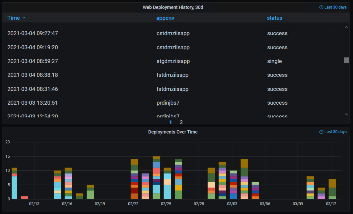
The most common cause of a misbehaving applications, were bugs introduced by an update. We created a script that sent deployment status metrics tagged by host, environment, application, activity, and status. We worked with development teams to add this script to the end of their CI/CD pipelines and deployment playbooks.
The result was a record of deployment activity that we could plot alongside a system’s performance graphs in Grafana.
Making the deployment data useful
Now that the data was in the same TSDB, we could then overlay it on our existing grafana graphs.
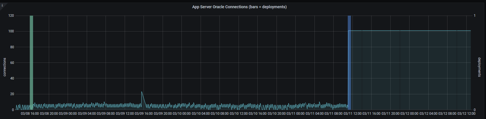
The blue and green vertical bars are deployments that ran against this host, and the moving line represents database connections opened by applications on the server.
Notice that immediately after the “blue” deployment on the right, the database connections shot to 100 and stayed there. In this case, some manual configuration changes were made to troubleshoot connectivity issues on the host… but the developer forgot to roll the changes back into their code. As a result, the next deployment bulldozed their manual config changes, and the connection issues reappeared.
This kind of overlay technique has been very useful in flushing out mysterious bugs, configuration drift, etc. With just a little bit of scripting knowledge, you can apply the same layer of visibility to other processes as well:
- Job schedulers
- Patching or maintenance scripts
- Ansible playbook runs, either as a task at the end of the playbook or as a callback plugin
- CI/CD pipelines
Obligatory “How did you do that in Grafana?”
If you run Grafana at your workplace and you are wondering how we achieved the above overlay effect, see below for an example:
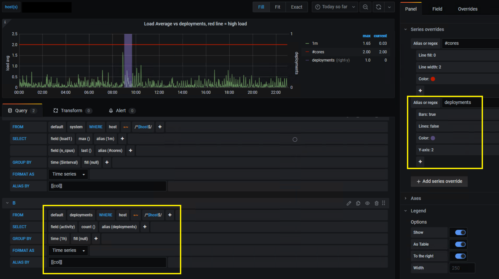
In our graph panel’s settings, we use the following series overrides and customizations for the deployment data:
- Use the right-hand y-axis
- Enable bars and disable lines
- Make the bar color semi-transparent
- For the right-hand Y axis, the upper limit is forced to 1- which makes any deployment activity appear as a vertical bar that cuts through the graph- giving us a clear and consistent marker for deployments.
- The deployment metrics are grouped into 1-hour “chunks” in the query, which makes the resulting deployment bars thicker and easier to see when the timeline is zoomed out.
- If your query for deployments gives you data points that are aliased by app name or environment, you can use series overrides with pattern matching to color-code your deployments.
Comments